Ordered in sequence of folio number
See also:
Contents
RLE: fluorescence bands -- top section of image is "fuzzy" ... seems to be true for all illuminations of the fluorescence bands. Reflectance images seem to be okay.
TRH: no idea... maybe ask Ken and Damian in OKC?
Amb_H190inf_003v_b01-b14_RF_cal_box51_bad_green_undertext_PCA_6bands_IPCA_14bands_PCA_R-1_G+2_B-3_img2_hue-100.jpg
TRH: This is my least favorite for the undertext, but the "glowing" of the rubric roman numberals is interesting. Is that a consequence of BAD?
Amb_H190inf_003v_b01-b14_RF_cal_undertext_green_ICA2_img2.tif (RLE01)
TRH: Very good in general. Also noticed that it supresses the rubric almost entirely except for xxii. Perhaps that was added with a different ink?
Amb_H190inf_003v_b01-b14_RF_cal_undertext_green_PCA_R-1_G2_B-5_img2_hue-100.tif
TRH: This is simlar to the next but slightly worse because the overtext has that distracting embossing effect. Also, the xxii is not distinct from the xxi.
Amb_H190inf_003v_b01-b14_RF_cal_undertext_green_RIC-2+BPC-1+GPC2_img2.tif (RLE02)
TRH: This is very nice and still shows that xxii is different from the other rubric roman numerals.
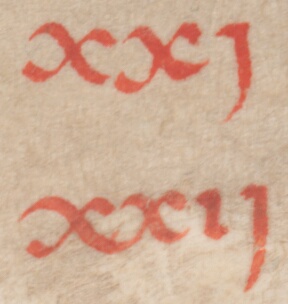 Accurate Color
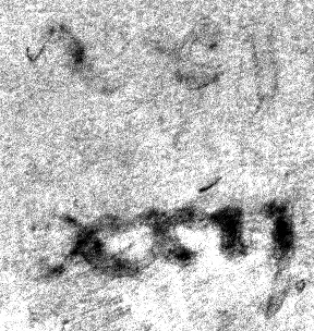 RLE01
RLE01
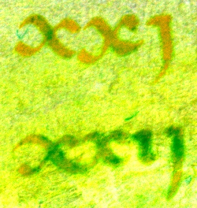 RLE02
RLE02
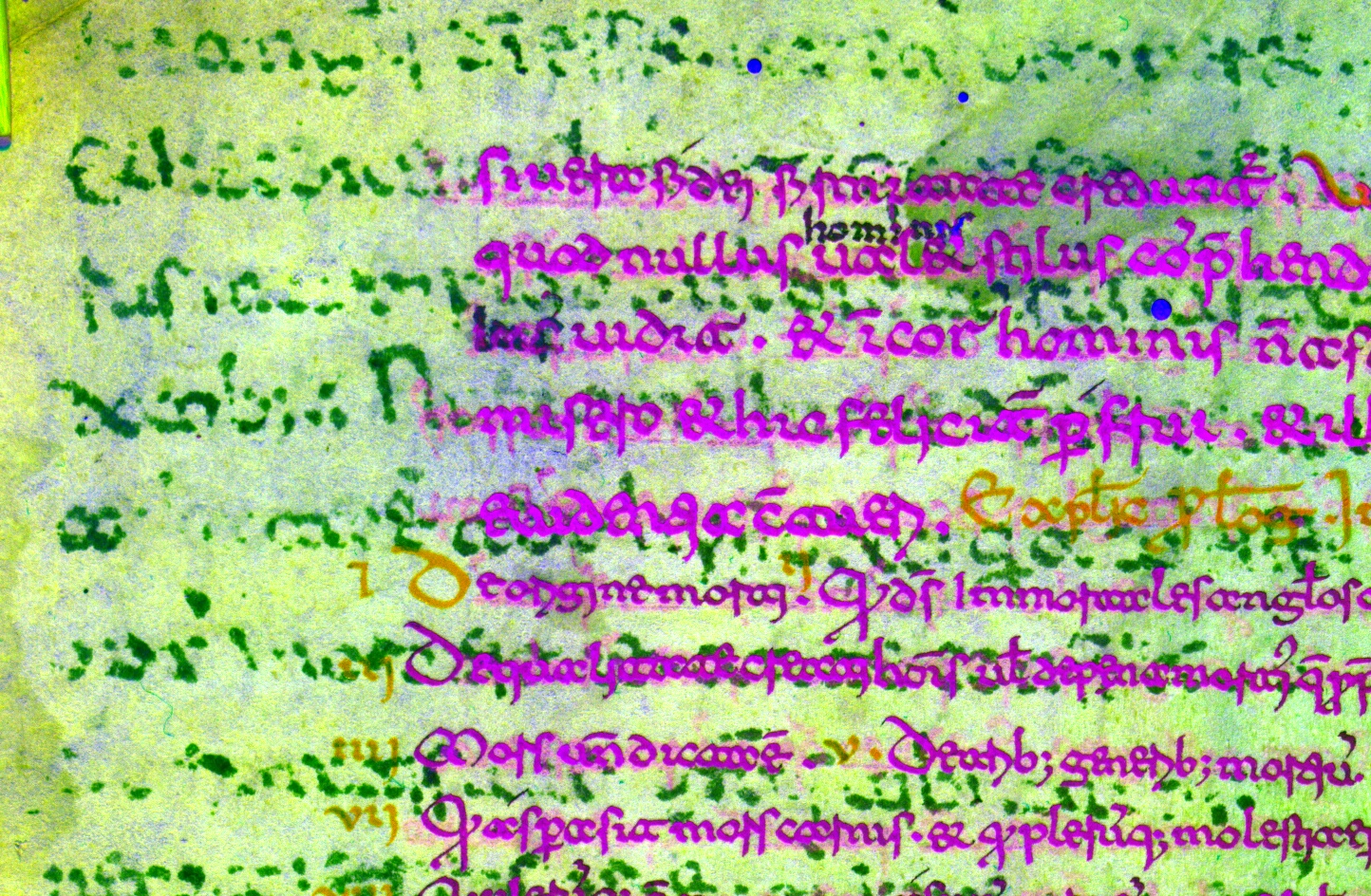 RLE02
RLE02
RLE: The one I like most is Amb_H190inf_004v_b01-b14_RF_cal_R9G5B2_365+455_BGOR_PC2_as_L.tif ... same "fuzziness" at top of image in the fluorescence bands of 004v as was seen in 003v
Amb_H190inf_004v_b01-b14_RF_cal_med3+box51_bad_green_undertext_365+455_BGOR_8bands_PCA2_img2.tif (RLE01)
Amb_H190inf_004v_b01-b14_RF_cal_R9G5B2_365+455_BGOR_PC2_as_L.tif (RLE02)
TRH: These are both nice and good enough to clarify which side is up (180 from capture, overtext), but still tough to read. The pseudocolor helps distinguish from overtext, but the gray/brown contrast isn't the easist, as pseudocolors go.
 Accurate Color
 KTK02
KTK02
 RLE02
RLE02
RLE: single band from 8-band PCA from BGOR fluorescence bands from 365 and 455 ... looks pretty good to my untrained and unreading eye
Amb_H190inf_014v_b15-b38_FL_med3_cal+box51_bad_green_undertext_365+455_BGOR_8bands_PCA2.tif (RLE01)
TRH: Very nice... I think this is also different from the others paleographically.
 Accurate Color
 RLE01
RLE01
Amb_H190inf_036v_b15-b36_FL_med3_cal_box51_bad_green_undertext_365+455_BGOR_8bands_PCA_R-1_G-2_B-3_img2_hue-125.tif (RLE01)
TRH: This undertext is rotated 270 from capture/overtext. A bifolio was trimmed to make a singlet folio. Very clear in some places, but suppression of overtext could be good in other places.
 Accurate Color
 RLE01
RLE01
RLE: perhaps not quite as distinct, but there is text there.
Amb_H190inf_042v_b15-b38_FL_med3_cal_box51_bad_green_undertext_365+455_BGOR_8bands_PCA_R-1_G-2_B+3_img2_hue-120.tif (RLE01)
Amb_H190inf_042v_b15-b38_FL_med3_cal_box51_bad_green_undertext_365+455_BGOR_8bands_PCA_R-2_G+3_B-4_img2_hue180.tif (RLE02)
TRH: These are very simliar in the undertext. The second is handy for getting oriented because the overtext rubric is distinct.
 Accurate Color
 KTK02
KTK02
 RLE01
RLE01
TRH 7/17/2017: We didn't capture the other side of this folio. Not clear that the marks we see around x,y,w,h=1773,3810,1766,572 are erased text.
 Accurate Color
 ImageJ PCA Pseudocolor
 NAP01
NAP01
NAP 7/29/2017: Unfortunately, I was only able to get the undertext to become visible in patches.... I worry that quite a lot of the undertext is just gone. So little of it came through in any of my processed images.
Amb_H190inf_088r_FL+W385+400+450_F_cal+med3_box101_bad_ICA_R-b3(450)_G-b3(400)_B-b3(385).tif
Amb_H190inf_088r_FL+W400+450_F_cal+med3_box41+101_bad_ICA_R+b3(400+41)_G-b3(450+101)_B-b3(400+101).tif
Amb_H190inf_088r_FL+W400+450_F_cal+med3_box101_bad_ICA_R-b3(450)_G-b3(400)_B-b3(400).tif (NAP01)
TRH 7/30/2017: NAP01 has very strong suppression of undertext. It appears that there are more than two layers of text. Consider the following three images from x,y,w,h=210,3971,400,148. The upper text reads clearly "mprud". There is something below the "m" and behind the "u". In the ImageJ PCA Pseudocolor they look similar (even more so than in accurate color). NAP01 shows clearly the "e" below the "m" and suppresses whatever is behind the "u". It could be a double palimpsest, or bleed from the other side or facing page.
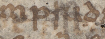 Accurate Color
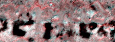 NAP01
NAP01
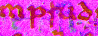 ImageJ PCA
TRH 7/12/2017: There's something going on around x,y,w,h=1596,3789,1870,962
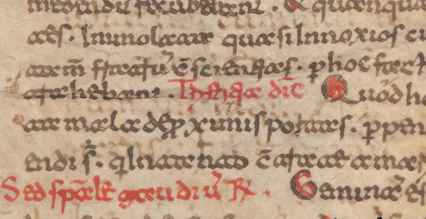 Accurate Color
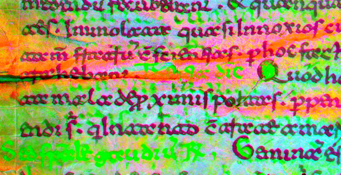 ImageJ PCA Pseudocolor
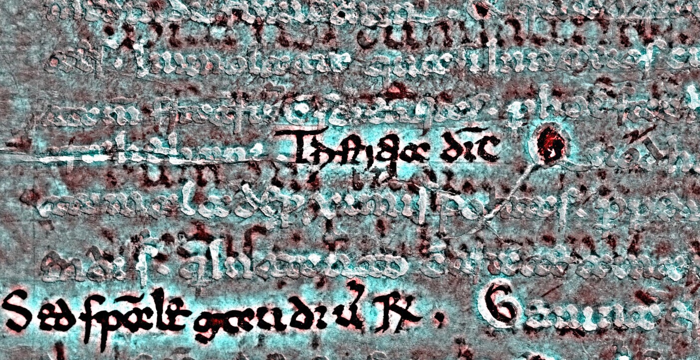 NAP01
NAP01
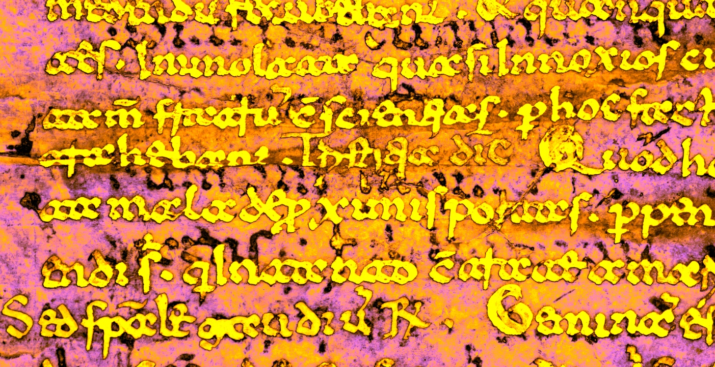 RLE01
RLE01
TRH 8/3/2017: The advanced processed files are all similarly limited in text that can be recovered. The differences are more in ease of reading than possibility of reading. Starkness of color contrast seems to be a matter of taste, but it is nice when the overtext, undertext, and parchment are in different colors. Radical suppression of overtext can be disorienting or lead to the false conclusion that no undertext can be there. This concern can be easily solved by flicking between different images.
Of the five uploaded by Roger and the interns I picked one with the best separation in contrasting colors to add to the repository:
Amb_H190inf_102r_SAM_overlay33-2_interactivestretching.tif (RLE01)
Of the three uploaded by Nicole I thought one was slightly more readable and pleasing to the eye, with good suppression of overtext:
Amb_H190inf_102r_RF_F_cal_box41+101_bad_PCA_R-b2(101)_G-b2(41)_B-b2(41)_u+180.tif (NAP01)